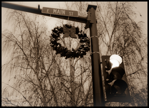
 For a few weeks I’ve been rather ambivalent about this shot. The color was off, it was too dark… something just didn’t look right. It wasn’t there.
The transition to sepia has made the difference. The monochrome color makes viewers look into the image – the coldness of the metal pole, the texture of the Christmas wreath, the soft, flowing texture of the birch tree in the background; everything gains life in the sepia image. Softening the clarity and adding a hint of a positive vignette helps to age the image and create a bit of a “timeless” look.
Tags: Locations


{ 0 comments… add one now }